Huzzah and/or jubilations! They're here at last! Callooh! Callay! Oh, frabjous day! Finally, after over a month of waiting, the results (ish) are in! Scores have been counted and recounted! Maths has been done and numbers have been... looked at...
Anyway, enough of this inane banter, it is time to find out who has won what and where and when and possibly even why! Seven glorious people sent entries to our very first Fan Art competition. These beautiful people are...
AlexFili, Enchilado, Slig #5719, Ridg3, Dryadri, MeechMunchie and Grieva!
Of the five judges I asked to... judge, only two got back to me! These equally beautiful people are...
Dripik and T-Nex!
The judges gave each piece a score out of ten on five different categories, making a potential total of 50 points. So added together, each entry was marked out of 100!
So here they are in order, from last to first.
In seventh place was...
MEECHMUNCHIE
With 50 points.
In sixth was...
ALEXFILI
With 56 points.
In fifth was...
ENCHILADO
With 59 points.
In fourth was...
SLIG #5719
With 62 points.
In third place was...
RIDG3
With 66 points.
In second was...
GRIEVA
With 72 points
But just four points ahead of Grieva,
IN FIRST PLACE WAS
 DRYADRI
With 76 out of 100!
Congratulations Dryadri, as well as everyone else who entered. Below are the entries, along with the comments made by the judges.
By MeechMunchie:
http://img696.imageshack.us/img696/1472/scannity2.jpg
Quality 8/20
Oddness 11/20
Originality 11/20
Use of theme 12/20
Enjoyment 8/20
Dripik said:
Notebook paper does not make a good impression. It says "I was at school and I was bored, so I drew this" (this might not be the case, but still...). Otherwise, good job with the Glukkon and the logo on the floor.
T-Nex said:
Ok this one, at first, I could not see what was going on at all. I'm sorry. I cheated and asked Splat, who told me that it was the scene from AO, where the glukkons get zapped.
First of all, the background looks like there are people, an audience or some thing like that. So my first guess was that it was an arena type of thing. But then it didn't make sense, because why would Shrykull and a glukkon be there?
There is also no contrast in the tones and colors at all... Which is important whether it's a sketch or a colored drawing. Contrasting is what brings it life. it also helps separating the elements so it's easier to tell what's going on.
It uses the theme rather well though. I can imagine the glukkon was terribly frightened few seconds before his death.
By AlexFili:
http://img13.imageshack.us/i/sligfears.png/
Quality 13/20
Oddness 10/20
Originality 14/20
Use of theme 8/20
Enjoyment 11/20
Dripik said:
A rather unique approach. More iconic than representative of a Slig, but well recognisable. I'm unsure whether a proper Slig would care about such thoughts, so I'd wager this is not your average Slig here.
T-Nex said:
I dunno if there's a lot to say about this. If you were going for the vector style picture, it would have done so much more if you had tried to make it look like a poster that came from Oddworld. The one's that you see during the games and stuff.
It maybe also would have helped if you used a logo type similar to the slig logo. In this piece, the lines aren't straight at all, which to me, seems like a sign of being rushed. I also don't know if the picture uses the theme that well. It seems it would have fit more under "personal insecurities" or something.
I also think that sligs are generally not that emotional. But on the other hand, the piece was rather original. It was very different from the other entries, and it's nice to see people going in other directions.
By Enchilado:
http://img94.imageshack.us/img94/401...10fearmudo.png
Quality 12/20
Oddness 12/20
Originality 13/20
Use of theme 11/20
Enjoyment 11/20
Dripik said:
It took me a while to realise what it is exactly I'm seeing here. Adding a bit more darkness to the ground under/around the Mudokon would tackle this problem and add a bit more sense of depht/height, I think.
T-Nex said:
Not a bad piece. It took me a while to see what's going on, but It fits the theme. I just wish things were a bit more clear. And maybe that the mudokons expression would be more desperate.
By Slig #5719:
http://www.glowfoto.com/viewimage.ph...=2010&srv=img4
Quality 12/20
Oddness 14/20
Originality 12/20
Use of theme 13/20
Enjoyment 11/20
Dripik said:
Good work, though the Mudokon's expresion is a tad comical to me - not my idea of fear. The background is quite good, but the window with the moon and the night sky kind of spoils the dense atmosphere of a Vykker laboratory.
T-Nex said:
Interesting concept. Though I don't know if there is much to say about it. I wish the expression would have been a bit more real and tangible. As I've said before, it would have helped if you used more contrast. Specially between the background and the mudokon and Vykker. It could have made the picture a little bit more dynamic.
By Ridg3:
http://yfrog.com/evfearxj
Quality 11/20
Oddness 14/20
Originality 14/20
Use of theme 16/20
Enjoyment 11/20
Dripik said:
This one's alright. Perhaps not the quality I'd submit for an art contest, but since I didn't submit anything, I guess I should remain silent. Ink is a good choice, but once you go with it, I think the whole picture should be in ink, not just the characters.
T-Nex said:
It seems rather unfinished. I have nothing against drawings made by black pens, they can make quite awesome drawings if you learn to take advantage of the pen properly.
The piece is extremely unfinished though, which is also why I scored it low Oddness and Enjoyment grade. The Slig and Musokon is pen, but then you switched to pencil for the background. Again, this may have been able to give and interesting result, but the way it is now, it seems rushed. If you have put details into the walls and the brackground, given in that rupture farms feel(Or whatever other factory it may be), it would have scored a lot higher.
The anatomy of the slig and mudokon aren't terrible so that's a plus. I Also like how the picture is from a scared musokon's point of view. Although a little more movement in the picture would have been better.
So yea, bottom like is it would have been greater if it wasn't so rushed and had more details. I thought the concept was rather original. And it uses the theme well.
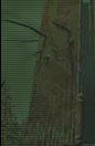
By Grieva
http://img175.imageshack.us/img175/2054/oac17.jpg
Quality 18/20
Oddness 15/20
Originality 14/20
Use of theme 9/20
Enjoyment 16/20
Dripik said:
Great job on this one. Awesome detail on the Mudokon and the bottle. It doesn't really reflect the concept of fear for me though - it's either 'apprehension' or 'melancholy', probably connected to the bottle 'o' Brew.
T-Nex said:
The premise is that I really like this picture. Lots of color, you also added depth by blurring the background which is a neat trick. The lighting on the mudokon could have been a bit better. He looks a tiny bit flat.
The thing I'm not so crazy about is it's use of the theme. It seems more like it would be "sorrow" or regrets. I'm not sure I understand entirely what's going on, on the picture.
To me it tell a story of a lonely mudokon, hence the very grey and dark background. He also looks extremely depressed and not so much frightened. It as if it's a mudokon who maybe escaped from a tough factory and never got over the horrors going on there.
Or he could have lived in a village, where several of his friends got killed or kidnapped by enslavers.
I also don't get the setting. Is it a mansion, house or a prison?(the windows could signal either, but I'm guessing it's not a prison).
Either way, if it's a house or a mansion, it's quite impossible that he lives in a village, as mudokon houses are a bit more primitive than that. WHich kinda leaves me confused again.
But either way, I like this image.
By Dryadri:
http://i40.tinypic.com/2zea642.jpg
Quality 15/20
Oddness 16/20
Originality 14/20
Use of theme 16/20
Enjoyment 15/20
Dripik said:
Quite good, this one. Captures the theme pretty well. Also, nice attempt at lighting but it's not entirely consistent in this form: the rope is awfully light at the Slog's neck while the Slog is rather dark. The Slig's hand is kinda hidden, I nearly missed it being there.
T-Nex said:
Really cool picture. I find it rather original. Very dark and scary. I think it would have made the picture a lot more dark and scary if the expression on the green mudokon had been different. I feel there could have been put a little bit more fear in his face. Right now he looks a bit too soft, and perhaps not as scared as he should be.
Also the blue mudokon confused me a bit. Is that supposed to be abe? I'm guessing it's not, since his feather is green, but it still lets me confused for a bit.
Either way I think it's a very cool concept and the details on the wall and stuff is pretty nifty.
-=-=-=-=-=-=-=-=-=-=-=-=-=-=-=-=-=-=-=-=-=-
And so, ladies and gentlemen, after all these long, arduous days of waiting, it's finally over. Big thanks to the people who entered. Big thanks to judges. And small thanks to people who tried to judge but were too busy with real life things; you guys rock anyway.
So, I hope this experience was enjoyable to artist, judge and observer alike. Next art competition will take place in the first half of next year. There should be a fiction competition starting around August or September. If anyone has any suggestions for themes for either of these competitions, feel free to make them

Anyway, congratulations to all; enjoy perusing the entries and finally being allowed to post your images on deviantArt
There Dripik; happy now?! x_x.

I'm going to sleep for a month.