Well, not Imgur. I'm not sure how those examples prove your point anyway, as many of them are very similar to mine.
:
|
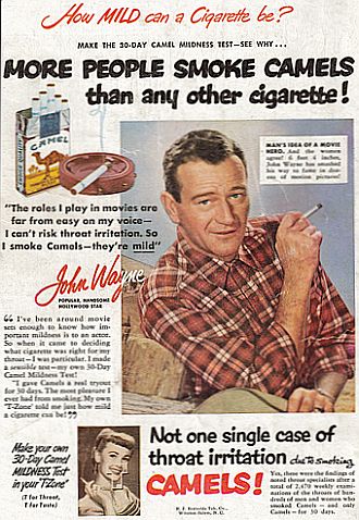
A parody is going to blatantly exaggerate things. Of course these are more lurid and colorful and simplified than actual 1950s ads.
|
But they are completely different. The plain, often classy text and use of either real people or realistic illustrations do not at all fit with what you see in Oddworld.
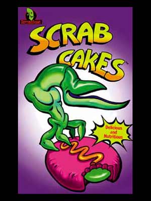
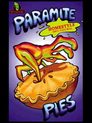
In fact, I did another Google search on "90s snack advertising", and here is some of what I got:

Too many examples to choose from. Similar colour use, similar goofy typography, and similar use of a simplistic looking mascot in order to present the food. Unsurprisingly for a game released in 1997, Abe's Oddysee parodied the snack marketing of the 90's, not the 50's.
The possibility that this might change, however, is pretty interesting.