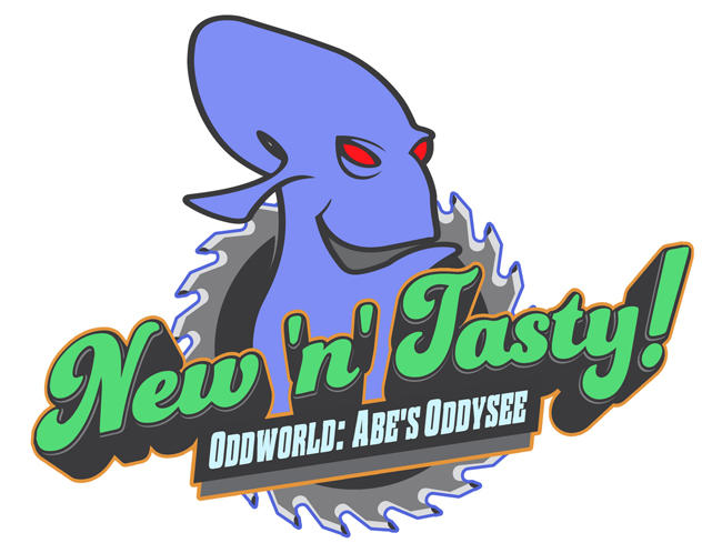
Wow, it's almost like they hired an amateur fanartist to make the logo at short notice OH WAIT THAT'S EXACTLY WHAT HAPPENED.
The aesthetic is fine, and the colour scheme is fine. The neck is off, and maybe the mouth should be black, and I'm pretty sure I posted an altered version myself the first time around, but there's complaining about something minor that you'll look at for all of the game*, and complaining about a minor element
of something minor, that you'll only see once, for a few seconds. For the love of all that's holy, knock it off.
It's a very noticeable shift in style, yes, but that's why the game is called New 'n' Tasty - JAW are trying to market the game as a highly transparent Glukkon rebrand; "The game you love: Now with 68% more 3D!" It's not fucking
Dragon's Crown.
We had a a boring argument about it already, guys. We each said our piece and let it be. I'll remind you all that the person who started this argument only did so because they weren't present at the first one. The prudent thing to do would have been to just link him back, not resurrect a dead discussion.
P.S. If you think this
:
|
they should have taken hints from the Bioshock logo because I really love that logo
|
is an argument, you'd be well-advised not to join a debate club.
If you all hate the logo that much, just make a new one and email it to JAW - you'll have the same odds the first guy did.
As for Manco,
you may as well drop him a line.
God forbid OANST sees all this, he's too young for heart failure.
*And at least I accept my complaints as minor, rather than, and I quote, "destroying the image of the entire series"
:
|
Why do you continue to instigate?
|
Gee if that ain't oxymoron of the fucking week
:
|
It's based on the label the glukkons would use. If anything, it's too good. How am I supposed to believe that a glukkon made this? They don't have drawing arms!
|
I like to imagine the Glukkons have enslaved a species entirely composed of graphic designers.
Dezzinerz