MOD EDIT: This thread was split off from New New 'n' Tasty News after this post. Read at your own peril.
Sup yall. Haven't been here for yonks. I sent an email to JAW in the middle of the night with my thoughts on the logo — which was the one thing in a beautiful, skilled and hope-instilling trailer that looked amateur and dumb — and thought today I'd like to share it in a place that I'd get like-minded validation or at least (hopefully?) amusing hate and drama.
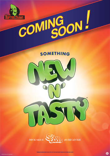
The wordmark is okay, but...
Look at that Glukkon head. It looks weird and awkward and wrong in so many places. For instance, how the neck drops behind the rest of the logo with no sign of a chin or shoulder, making the neck look misshapen. The inside of the mouth is the same colour as the saw, so are we looking through the mouth? Is the mouth in profile and the eyes at a 3/4 angle? The oval above the ear makes the back of the Glukkon mantle look like some sort of head-tail, like it is tapering off to a point behind his head. The saw is worse, and I fully believe it was thrown together in 180 seconds or less.
I'm not done yet: the whole freaking composition is wrong. The head, saw and workmark each look like they could have been made for different things and were thrown together without consideration for clashing line weights and forms. There are too many layers, and little congruence between them. Look at where the Glukkon head outline merges to the inside of the saw, or where the outlines from the saw and the wordmark touch, for examples of where I saw awkwardness and disharmony.
Darn and blast it, we have to face facts: that thing is a mess. I've looked at it a hundred times since I first saw the trailer and it looks worse each time.
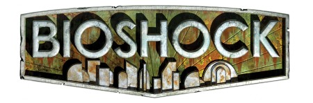
Below are a few images that might have had similar criterea to the NnT logo (a flat vector style, a character or item, fitting several words, ect), but are examples of handling it professionally. These are just for perspective (also so there is something pretty to look at in my post):


No doubt there are better examples (please post if you know any).
Then there is the style question (ie. why doesn't this look like the old logos?). I fully appreciate the flat vector style in the right place, but if there is one place you can, and want to, do something extravagant, it is for a videogame. It's not a brand or an app. You want to convey "RICH DETAILED WORLD, COME INSIDE".


Consider that the old logos much better represented the atmosphere of the games.
I appreciate most people won't feel as strongly as I do, but then I'm probably more into logos then most people are also, so please forgive me if if this sounds excessive. I'm just saying what I see, and what I see is a logo that makes this otherwise beautiful game look just a little dumb and amateur.