Oddworld Forums > Zulag One > Oddworld Discussion


Thread Tools
 
  #1  
02-04-2014, 10:44 AM
Connell's Avatar
Connell
Outlaw Shooter
 
: Apr 2011
: Britain
: 1,326
Blog Entries: 3
Rep Power: 15
Connell  (1407)Connell  (1407)Connell  (1407)Connell  (1407)Connell  (1407)Connell  (1407)Connell  (1407)Connell  (1407)Connell  (1407)Connell  (1407)
N'n'T Box art

http://www.oddworld.com/2014/02/oddw...tasty-box-art/

__________________
In Odd We Trust.

  #2  
02-04-2014, 10:48 AM
El Dango AGAIN's Avatar
El Dango AGAIN
Fuzzle
 
: Nov 2013
: AAARRRRH
: 110
Rep Power: 12
El Dango AGAIN  (162)El Dango AGAIN  (162)

The background's cool, but the yellow glow confuses me.
__________________
http://www.oddworldforums.net/signaturepics/sigpic13359_3.gif
Get them pants off!

  #3  
02-04-2014, 10:59 AM
MeechCrunchies's Avatar
MeechCrunchies
Rabid Fuzzle
 
: Jul 2010
: Wrigglin in Elum's extremities
: 527
Rep Power: 15
MeechCrunchies  (255)MeechCrunchies  (255)MeechCrunchies  (255)

AHH HOLY SHIT THIS IS AWESOME!
__________________
:
I have a marble up my arsehole...wut?

  #4  
02-04-2014, 11:09 AM
STM's Avatar
STM
Anarcho-Apiarist
 
: Jun 2008
: Your mother
: 9,859
Blog Entries: 161
Rep Power: 27
STM  (6435)STM  (6435)STM  (6435)STM  (6435)STM  (6435)STM  (6435)STM  (6435)STM  (6435)STM  (6435)STM  (6435)STM  (6435)

URGH IT'S SO SHIT, GOD.

There you go, there's what the subsequent nitpicking will amount to, out the way.

Now *clears throat* holy shit, this looks fucking amazing, holy shiiiiiit! Almost a shame how much the logo takes up the image in fact. Shame this means there'll be no boxed copy of the game though.
__________________
:
Oh yeah, fair point. Maybe he was just tortured until he lost consciousness.


Last edited by STM; 02-04-2014 at 11:12 AM..
  #5  
02-04-2014, 11:17 AM
Nepsotic's Avatar
Nepsotic
8===========D~
 
: Aug 2011
: 5,425
Blog Entries: 91
Rep Power: 19
Nepsotic  (3941)Nepsotic  (3941)Nepsotic  (3941)Nepsotic  (3941)Nepsotic  (3941)Nepsotic  (3941)Nepsotic  (3941)Nepsotic  (3941)Nepsotic  (3941)Nepsotic  (3941)Nepsotic  (3941)

That looks really really good. There ARE things to nitpick, but fuck it. Also hey, Abe's eyes actually look like eyes.

The logo ruins it.
__________________
:
all Meechmunchie did by trying to troll me was distract from the fact you all have no regard for Hetro or their rights at all, none.
- EVP_Glukkon/Oxide

  #6  
02-04-2014, 11:29 AM
Connell's Avatar
Connell
Outlaw Shooter
 
: Apr 2011
: Britain
: 1,326
Blog Entries: 3
Rep Power: 15
Connell  (1407)Connell  (1407)Connell  (1407)Connell  (1407)Connell  (1407)Connell  (1407)Connell  (1407)Connell  (1407)Connell  (1407)Connell  (1407)

:
That looks really really good. There ARE things to nitpick, but fuck it. Also hey, Abe's eyes actually look like eyes.

The logo ruins it.
This.
__________________
In Odd We Trust.

  #7  
02-04-2014, 11:43 AM
MeechMunchie's Avatar
MeechMunchie
Sgt. Sideburns
 
: Mar 2009
: :noiƚɒɔo⅃
: 9,743
Blog Entries: 83
Rep Power: 32
MeechMunchie  (14320)MeechMunchie  (14320)MeechMunchie  (14320)MeechMunchie  (14320)MeechMunchie  (14320)MeechMunchie  (14320)MeechMunchie  (14320)MeechMunchie  (14320)MeechMunchie  (14320)MeechMunchie  (14320)MeechMunchie  (14320)

I guess I'm kind of used to the electric contrast of the old CGI art, but this has a certain charm to it too.

  #8  
02-04-2014, 11:46 AM
El Dango AGAIN's Avatar
El Dango AGAIN
Fuzzle
 
: Nov 2013
: AAARRRRH
: 110
Rep Power: 12
El Dango AGAIN  (162)El Dango AGAIN  (162)

The logo is the kind of thing that would look more fitting if it was painted on some sort of rusty surface, like this:


Maybe if they had made it smaller and placed it on a billboard or something, it would have looked better.

I'd love to see the background by itself at some point.
__________________
http://www.oddworldforums.net/signaturepics/sigpic13359_3.gif
Get them pants off!

  #9  
02-04-2014, 12:04 PM
Pirfsich's Avatar
Pirfsich
Sniper Wasp
 
: Aug 2013
: Germany
: 293
Rep Power: 12
Pirfsich  (266)Pirfsich  (266)Pirfsich  (266)

I came here to see the bitching about this piece, just like the NnT Logo.
I found none so far.

It looks awesome indeed.
Lorne did a great job! ~( :x)
*hides*
  #10  
02-04-2014, 12:05 PM
Varrok's Avatar
Varrok
Wolvark Grenadier
 
: Jun 2009
: Beartopia
: 7,301
Blog Entries: 52
Rep Power: 25
Varrok  (7896)Varrok  (7896)Varrok  (7896)Varrok  (7896)Varrok  (7896)Varrok  (7896)Varrok  (7896)Varrok  (7896)Varrok  (7896)Varrok  (7896)Varrok  (7896)

The shitty logo is still shitty. They didn't even bother to fix the god-awful edges, the head hole and mouth. Jesus, careless slackers.

The background, on the other hand looks really neat. I think I really like it.
  #11  
02-04-2014, 12:10 PM
Pirfsich's Avatar
Pirfsich
Sniper Wasp
 
: Aug 2013
: Germany
: 293
Rep Power: 12
Pirfsich  (266)Pirfsich  (266)Pirfsich  (266)

Edges? What? Could you tell me, where you see awful edges? The neck thing doesnt count!
  #12  
02-04-2014, 12:11 PM
Varrok's Avatar
Varrok
Wolvark Grenadier
 
: Jun 2009
: Beartopia
: 7,301
Blog Entries: 52
Rep Power: 25
Varrok  (7896)Varrok  (7896)Varrok  (7896)Varrok  (7896)Varrok  (7896)Varrok  (7896)Varrok  (7896)Varrok  (7896)Varrok  (7896)Varrok  (7896)Varrok  (7896)

I meant the neck thing.
  #13  
02-04-2014, 12:13 PM
Pirfsich's Avatar
Pirfsich
Sniper Wasp
 
: Aug 2013
: Germany
: 293
Rep Power: 12
Pirfsich  (266)Pirfsich  (266)Pirfsich  (266)

Alright xD
  #14  
02-04-2014, 12:42 PM
Crashpunk's Avatar
Crashpunk
cun't spill
 
: Feb 2008
: Nottingham, UK
: 7,291
Blog Entries: 47
Rep Power: 25
Crashpunk  (5534)Crashpunk  (5534)Crashpunk  (5534)Crashpunk  (5534)Crashpunk  (5534)Crashpunk  (5534)Crashpunk  (5534)Crashpunk  (5534)Crashpunk  (5534)Crashpunk  (5534)Crashpunk  (5534)

Looks really great. The artwork of Rupture Farms looks amazing and the yellow outline around the logo is a nice touch.

No complains from me. (apart from the logo obviously.)
__________________

Twitter | Discord: Crashpunk#0025

  #15  
02-04-2014, 01:02 PM
Nepsotic's Avatar
Nepsotic
8===========D~
 
: Aug 2011
: 5,425
Blog Entries: 91
Rep Power: 19
Nepsotic  (3941)Nepsotic  (3941)Nepsotic  (3941)Nepsotic  (3941)Nepsotic  (3941)Nepsotic  (3941)Nepsotic  (3941)Nepsotic  (3941)Nepsotic  (3941)Nepsotic  (3941)Nepsotic  (3941)

I think maybe it'd look more pleasing if Abe's head was further down as opposed to at the top. But wait, then where would the awesome logo go?
__________________
:
all Meechmunchie did by trying to troll me was distract from the fact you all have no regard for Hetro or their rights at all, none.
- EVP_Glukkon/Oxide

  #16  
02-04-2014, 01:06 PM
Varrok's Avatar
Varrok
Wolvark Grenadier
 
: Jun 2009
: Beartopia
: 7,301
Blog Entries: 52
Rep Power: 25
Varrok  (7896)Varrok  (7896)Varrok  (7896)Varrok  (7896)Varrok  (7896)Varrok  (7896)Varrok  (7896)Varrok  (7896)Varrok  (7896)Varrok  (7896)Varrok  (7896)

They purposely moved the ugly Abe head just to show off the most beautiful thing which is the logo.
  #17  
02-04-2014, 01:09 PM
DarkHoodness's Avatar
DarkHoodness
Page 7, Post 199
 
: Apr 2001
: In a box.
: 3,438
Blog Entries: 53
Rep Power: 28
DarkHoodness  (2104)DarkHoodness  (2104)DarkHoodness  (2104)DarkHoodness  (2104)DarkHoodness  (2104)DarkHoodness  (2104)DarkHoodness  (2104)DarkHoodness  (2104)DarkHoodness  (2104)DarkHoodness  (2104)DarkHoodness  (2104)

It looks very good and sums up what the game is about, and I like how it's reminiscent of the posters that were made for AE, but like a few others here I wish they'd address the logo somehow, since I feel its low quality contrasts with the rest of the image.

Maybe it can be "Fixed" by presenting it in a different way, like how El Dango suggested.
__________________

  #18  
02-04-2014, 01:14 PM
Fuzzle Guy's Avatar
Fuzzle Guy
Outlaw Flamer
 
: Apr 2003
: Greater London, UK
: 2,634
Blog Entries: 17
Rep Power: 25
Fuzzle Guy  (2482)Fuzzle Guy  (2482)Fuzzle Guy  (2482)Fuzzle Guy  (2482)Fuzzle Guy  (2482)Fuzzle Guy  (2482)Fuzzle Guy  (2482)Fuzzle Guy  (2482)Fuzzle Guy  (2482)Fuzzle Guy  (2482)Fuzzle Guy  (2482)

What's everyone's fuss with the logo?

It's not low quality, it's just stylised to be minimalistic?

Very nice Poster. Can't wait to play!
__________________

  #19  
02-04-2014, 01:17 PM
Varrok's Avatar
Varrok
Wolvark Grenadier
 
: Jun 2009
: Beartopia
: 7,301
Blog Entries: 52
Rep Power: 25
Varrok  (7896)Varrok  (7896)Varrok  (7896)Varrok  (7896)Varrok  (7896)Varrok  (7896)Varrok  (7896)Varrok  (7896)Varrok  (7896)Varrok  (7896)Varrok  (7896)

The Glukkon head somehow manages to be both low quality and minimalistic.
  #20  
02-04-2014, 02:24 PM
Job McYossie's Avatar
Job McYossie
Outlaw Cutter
 
: Dec 2013
: Among the unmade music
: 1,086
Blog Entries: 24
Rep Power: 12
Job McYossie  (857)Job McYossie  (857)Job McYossie  (857)Job McYossie  (857)Job McYossie  (857)Job McYossie  (857)Job McYossie  (857)

I like it. The background is filled with such depth, and abe's face is perfect. You can see the dried skin beginning to crack around his stitch holes. It has proper colour symmetry. I could almost love it. That logo though, clashes in style so much. Sometimes clashing works. This is not one of those times.
__________________


Xorlidyr: The tidal waves clean our sins.

My Steam: spiderqueen ;Oddio is the best pun

  #21  
02-04-2014, 02:35 PM
V_O_T's Avatar
V_O_T
Super Stingbee
 
: Sep 2012
: Australia
: 471
Rep Power: 13
V_O_T  (451)V_O_T  (451)V_O_T  (451)V_O_T  (451)V_O_T  (451)

:
What's everyone's fuss with the logo?

It's not low quality, it's just stylised to be minimalistic?

Very nice Poster. Can't wait to play!
The logo doesn't match the CGI-esqu background. It's like putting big red text on the Mona Lisa saying "Mona Lisa - Rebirth"

You want to be able to see what's so new about it but the logo is blocking your view. Take a look at the original Abe's oddysee logo with that purple gem. It looks 3D and the same style of all it's surroundings.

This logo is best just to be a sign or poster that would be seen in game. Right now it's merging high quality 3D and well detailed art with a cartoony logo with too much going on. The original rupture farms logo is a simple circle, name and gluk head. Much more effective and simplistic.

But forget about what I just wrote because I don't want to start a "OMG nnt logo shit flinging argument"

I like the effort on it, love the background, but I think the logo has room for improvement. My2cents.
__________________
I eat bees.

  #22  
02-04-2014, 02:59 PM
Fuzzle Guy's Avatar
Fuzzle Guy
Outlaw Flamer
 
: Apr 2003
: Greater London, UK
: 2,634
Blog Entries: 17
Rep Power: 25
Fuzzle Guy  (2482)Fuzzle Guy  (2482)Fuzzle Guy  (2482)Fuzzle Guy  (2482)Fuzzle Guy  (2482)Fuzzle Guy  (2482)Fuzzle Guy  (2482)Fuzzle Guy  (2482)Fuzzle Guy  (2482)Fuzzle Guy  (2482)Fuzzle Guy  (2482)

The Glukkon Head definitely isn't low quality! In fact it seems to be a perfect high res vector, at least when viewed with the retina display on my Macbook (Yep, today I'm gonna be THAT guy.)
__________________

  #23  
02-04-2014, 03:14 PM
MeechMunchie's Avatar
MeechMunchie
Sgt. Sideburns
 
: Mar 2009
: :noiƚɒɔo⅃
: 9,743
Blog Entries: 83
Rep Power: 32
MeechMunchie  (14320)MeechMunchie  (14320)MeechMunchie  (14320)MeechMunchie  (14320)MeechMunchie  (14320)MeechMunchie  (14320)MeechMunchie  (14320)MeechMunchie  (14320)MeechMunchie  (14320)MeechMunchie  (14320)MeechMunchie  (14320)

Come on guys, if I can be grudgingly positive...

The style is different. It's not a good thing or a bad thing, it's just a thing. A little less Tron, a little more Star Wars.


Last edited by MeechMunchie; 02-04-2014 at 03:17 PM..
  #24  
02-04-2014, 03:20 PM
Jordan's Avatar
Jordan
Screaming Bender
 
: Jan 2006
: England
: 4,829
Blog Entries: 28
Rep Power: 24
Jordan  (1975)Jordan  (1975)Jordan  (1975)Jordan  (1975)Jordan  (1975)Jordan  (1975)Jordan  (1975)Jordan  (1975)Jordan  (1975)Jordan  (1975)Jordan  (1975)

Love it. Shame we won't get to see it on an actual box though.
  #25  
02-04-2014, 03:29 PM
Fuzzle Guy's Avatar
Fuzzle Guy
Outlaw Flamer
 
: Apr 2003
: Greater London, UK
: 2,634
Blog Entries: 17
Rep Power: 25
Fuzzle Guy  (2482)Fuzzle Guy  (2482)Fuzzle Guy  (2482)Fuzzle Guy  (2482)Fuzzle Guy  (2482)Fuzzle Guy  (2482)Fuzzle Guy  (2482)Fuzzle Guy  (2482)Fuzzle Guy  (2482)Fuzzle Guy  (2482)Fuzzle Guy  (2482)

:
Come on guys, if I can be grudgingly positive...

The style is different. It's not a good thing or a bad thing, it's just a thing. A little less Tron, a little more Star Wars.
This ain't Star Wars folks!
__________________

  #26  
02-04-2014, 04:12 PM
Nepsotic's Avatar
Nepsotic
8===========D~
 
: Aug 2011
: 5,425
Blog Entries: 91
Rep Power: 19
Nepsotic  (3941)Nepsotic  (3941)Nepsotic  (3941)Nepsotic  (3941)Nepsotic  (3941)Nepsotic  (3941)Nepsotic  (3941)Nepsotic  (3941)Nepsotic  (3941)Nepsotic  (3941)Nepsotic  (3941)

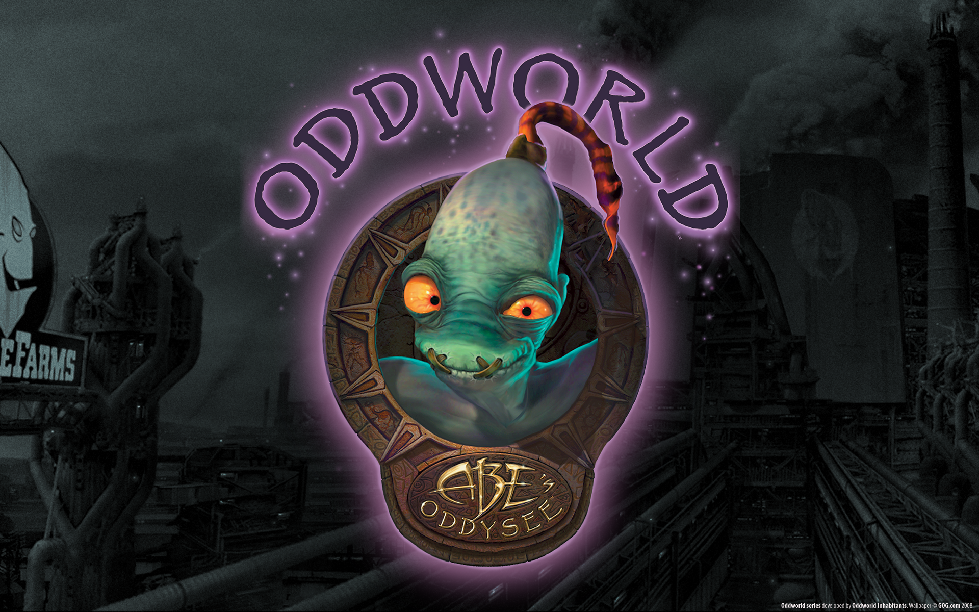
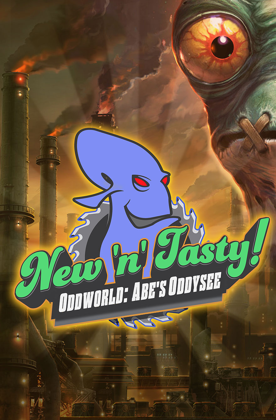
Despite the logo, it's a good poster (apart from the fact that Abe really doesn't fit there at all). However, it doesn't fit with Oddworld and Abe's Oddysee at all, the colours, the atmosphere, nothing. Shit, they even did the big half-head think. This isn't an epic action flick, and that seems to be what they're going for, even with the trailer.
It's weird, from what we've seen so far, despite the gameplay footage, it looks as if the designers have no understanding of the original game, it's atmosphere and the world it was trying to create. At all. There's no sense of lonliness or isolation, not even the feeling of impending doom with the original did so well in it's artwork and promotional images.
The colours in this seem to be leaning more towards Exoddus rather than Oddysee, and despite what you may think the two are worlds apart in terms of atmosphere.

It's nice as a poster, but they're making it for the wrong thing.


__________________
:
all Meechmunchie did by trying to troll me was distract from the fact you all have no regard for Hetro or their rights at all, none.
- EVP_Glukkon/Oxide


Last edited by Nate; 02-04-2014 at 05:05 PM.. : Fixed image stretch.
  #27  
02-04-2014, 04:43 PM
MeechMunchie's Avatar
MeechMunchie
Sgt. Sideburns
 
: Mar 2009
: :noiƚɒɔo⅃
: 9,743
Blog Entries: 83
Rep Power: 32
MeechMunchie  (14320)MeechMunchie  (14320)MeechMunchie  (14320)MeechMunchie  (14320)MeechMunchie  (14320)MeechMunchie  (14320)MeechMunchie  (14320)MeechMunchie  (14320)MeechMunchie  (14320)MeechMunchie  (14320)MeechMunchie  (14320)

You've got to bear in mind that this is a remake, targeted squarely at existing fans of Abe. The first two games had him looking him generally insignificant and putupon, but now he's got a legacy to live up to, and while hiding him amidst machinery might be the most thematically appropriate thing to do, it's not what the fans want.

Heck, just look at the cover of Munch's Oddysee - it's not like OWI have never traded on Abe's reputation before.

:
This isn't an epic action flick
Of course not.

Seriously though, back when NnT was in development, nitpicking could at least be brushed aside as a failed attempt at constructivity. The game is finished, and now JAW just have to market it in a way that will sell. That's not really the realm of taste and opinion - it's just business.

On an unrelated note, bladders.


Last edited by MeechMunchie; 02-05-2014 at 12:00 AM..
  #28  
02-04-2014, 04:57 PM
Job McYossie's Avatar
Job McYossie
Outlaw Cutter
 
: Dec 2013
: Among the unmade music
: 1,086
Blog Entries: 24
Rep Power: 12
Job McYossie  (857)Job McYossie  (857)Job McYossie  (857)Job McYossie  (857)Job McYossie  (857)Job McYossie  (857)Job McYossie  (857)

I do kinda want more smiling abe though, he seems to never smile anymore.
__________________


Xorlidyr: The tidal waves clean our sins.

My Steam: spiderqueen ;Oddio is the best pun

  #29  
02-04-2014, 05:00 PM
MeechMunchie's Avatar
MeechMunchie
Sgt. Sideburns
 
: Mar 2009
: :noiƚɒɔo⅃
: 9,743
Blog Entries: 83
Rep Power: 32
MeechMunchie  (14320)MeechMunchie  (14320)MeechMunchie  (14320)MeechMunchie  (14320)MeechMunchie  (14320)MeechMunchie  (14320)MeechMunchie  (14320)MeechMunchie  (14320)MeechMunchie  (14320)MeechMunchie  (14320)MeechMunchie  (14320)

If you all turn to pages 148-149 of The First Ten Years, I think a RuptureFarms equivalent of top row second-from-the-left and far-right are what I'd really like to see; a twisting, claustrophobic tangle of machinery closing in as Abe realises how small and closed his life up to this point has been, the walls of home suddenly becoming the walls of a prison.

But hey, that's what fan-artists are for.

  #30  
02-04-2014, 05:09 PM
Slog Bait's Avatar
Slog Bait
Outlaw Sniper
 
: Dec 2008
: Middle of a desert
: 1,669
Blog Entries: 33
Rep Power: 19
Slog Bait  (2520)Slog Bait  (2520)Slog Bait  (2520)Slog Bait  (2520)Slog Bait  (2520)Slog Bait  (2520)Slog Bait  (2520)Slog Bait  (2520)Slog Bait  (2520)Slog Bait  (2520)Slog Bait  (2520)

If they were marketing to just the fans it wouldn't be all flashy and showy, it would focus more on the original atmosphere, since that was one of the biggest things about AO.

I think after seeing how they're trying to market NnT, we can establish OWI doesn't know how to market their own damn products. They always seem to go for the really over the top form of advertising that doesn't present the games for what they are in and of themselves, with the exception of SW.

The advertising for NnT makes AO seem more like an action filled epic. While the quintology may be classified as an epic, we already know AO is not action-packed.

If I didn't already know what AO was and what it was about, through the reveals up til now, I would have no idea what it was and would lose interest in it entirely. One of my friends completely unfamiliar with Oddworld did just that.

The people in charge of marketing the game don't seem to know what they're marketing for.

Heck, Lorne doesn't seem to even know what he's marketing for. See: The logo we all love so very much

I give up trying to write this post I'm just too fucking tired unironic 'omg' here


Currently Active Users Viewing This Thread: 1 (0 members and 1 guests)


- Oddworld Forums - -