:
|
Do a quick Google Image search for “1950s poster”. What you’ll find are bright colors with bold, often hand-cut or hand-painted typography, and cheesy illustrations and slogans. This fits Glukkon marketing to a T.
|
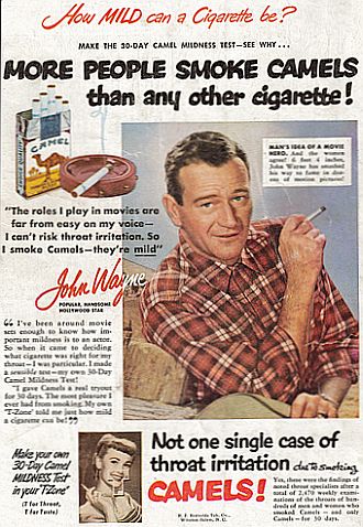
Searching "1950's poster" gave me a lot of movie posters, so I decided to do a more fitting search on "1950's advertising" instead. A lot of the results had little to no colour at all, and for those that did, we're talking pretty mild stuff:

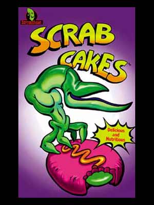
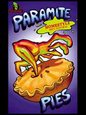
Meanwhile, Glukkon marketing looks like this:
Let's compare that to the New 'N' Tasty logo:

The difference mostly has to do with the use of colours and typography (the Glukkon head symbol itself is straight from the original after all), but it's pretty clear once you compare it to previous material. I'd like to point out that I'm not dissatisfied by this change at all, I just wonder why it was made.
Possible Bioshock influence?