11-18-2013, 07:02 AM
|
 |
Spark Stunk
|
|
: Jan 2012
: UK
: 371
Rep Power: 15
|
|

:


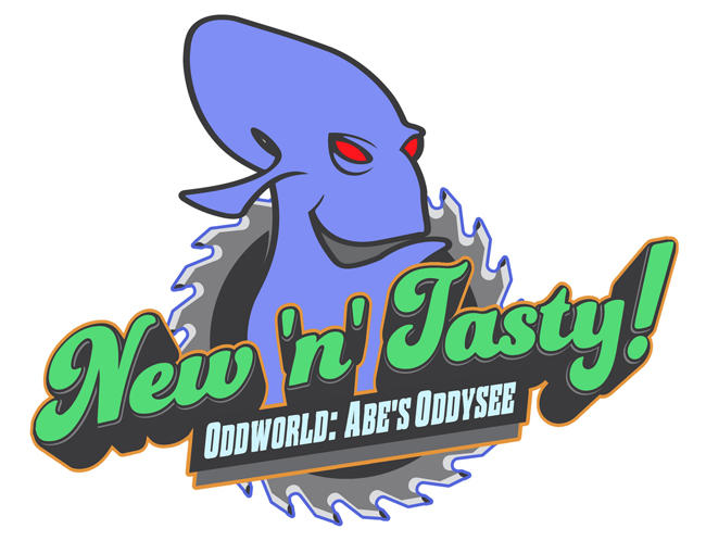
The wordmark is okay, but...
Look at that Glukkon head. It looks weird and awkward and wrong in so many places. For instance, how the neck drops behind the rest of the logo with no sign of a chin or shoulder, making the neck look misshapen. The inside of the mouth is the same colour as the saw, so are we looking through the mouth? Is the mouth in profile and the eyes at a 3/4 angle? The oval above the ear makes the back of the Glukkon mantle look like some sort of head-tail, like it is tapering off to a point behind his head. The saw is worse, and I fully believe it was thrown together in 180 seconds or less.
I'm not done yet: the whole freaking composition is wrong. The head, saw and workmark each look like they could have been made for different things and were thrown together without consideration for clashing line weights and forms. There are too many layers, and little congruence between them. Look at where the Glukkon head outline merges to the inside of the saw, or where the outlines from the saw and the wordmark touch, for examples of where I saw awkwardness and disharmony. |
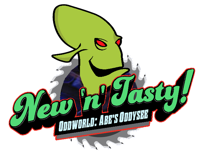
How's this? Just a basic thing I did quick. I know there's spots around it and stuff but I'm not talking about that I mean the basic design of it.

__________________

|
|
|