:
|
Slapping 5 different images together and using a soft brush on the edges is not graphic design...
|
That's not what I have done....
:
|
Either works, really. From what I understand, most of the graphics are going to be hand done. If we were just cutting and pasting junk like pupbenny's banner, it would probably be easier to do the latter. How we're going about the project, however, is flexible enough for us to do either with ease.
|
As I've said, this is a prototype of how it
COULD look. That's why I've just "copied and pasted junk". I'm not going to spend hours making Oddworld images from scratch - Which I wouldn't even know how to go about doing that - when I'm just showing you guys stuff and giving you ideas.
:
|
That one isn't as bad. It's a cluttered mess with grossly varying pixel densities, but it's an improvement over the Sweet Bro and Hella Jeff quality of the first.
|
The pixels look like that because I blurred them for effect. I also put smoke in to make it look like pollution and factories, ect again to give it effect.
EDIT: Here, I made another version quickly to show that I've blurred the image, not changed the size so much the pixels are blurred. Bare in mind I did this
REALLY quickly just to show you. It would be in much better quality if I'd done it properly.
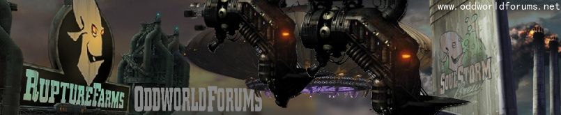
What one do you think is better? (If this one was in better qaulity and if I'd worked more time on it. ) If you think it's this one then I know you prefer quality, if it's the other then effect.