Blogs


  Oddworld Forums > Blogs > Quetzalcoatl's Copper Kettle


underwhelming self-referential blog header
Rate this Entry

Arbitrary Question Time

Posted 07-28-2014 at 03:35 PM by MeechMunchie


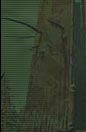
In purely aesthetic terms, which of these squares do you think looks the best? Pick one or two, three if you must.

No, Varrok, you can't pick a white one.
Total Comments 12

Comments

Job McYossie's Avatar
Far right, middle, dark green center, bright green surround.
Posted 07-28-2014 at 04:14 PM by Job McYossie

Mac Sirloin's Avatar
Row 4 Column 2

Row 3 Column 7

Row 4 Column 6 Is the best.
Posted 07-28-2014 at 04:45 PM by Mac Sirloin

Oddey's Avatar
Row 2 Column 2

Row 4 Column 2

Row 1 Column 6

in order of best to third-best.
Posted 07-28-2014 at 10:10 PM by Oddey

Manco's Avatar
Row 6 Column 3.

Now tell us what underlying disorders we all have.
Posted 07-28-2014 at 11:04 PM by Manco

Mac Sirloin's Avatar
I bet I'm a rapist. My priest always told me I was after I raped him.

that was in poor taste but I'm drunk and not prepared to regret it yet
Posted 07-28-2014 at 11:24 PM by Mac Sirloin

Mr. Bungle's Avatar
red one is cool
Posted 07-29-2014 at 01:45 AM by Mr. Bungle

Varrok's Avatar
I'm picking the only block that's surrounded by only one white block (horizontally/vertically).
Just kidding. I'm picking that white one next to it
Posted 07-29-2014 at 01:53 AM by Varrok

MeechMunchie's Avatar
Hah! I tricked you all! It's not really arbitrary!

I'm (probably) making a Roguelike Minecraft skin, and there's 50+ conceivable ways to combine a text character, the default skin, and two colours (character/background). I culled that list myself, based on text legibility, and put the remainder up to see what people liked.

The green is grass, the red/grey is netherrack. The two sets of textures are actually the same 9 "methods" used on two different textures, but I didn't tell you that - in theory, the best "method" should get high votes on both of its textures.

Here's how the votes worked out.


STM MM WoF Job Mac Oddey Manco Bungle Varrok

- (2,1/4) was the runaway winner, with four votes.

- Helpfully, it's also one of the simplest - the default ASCII background, with a transparent glyph, layered over the default Minecraft texture i.e a text-shaped "window".

-The runner-up, (7,3/6), was a bit more involved: The ASCII background, set to the colour of the glyph, with the glyph itself transparent, laid over a 50% opacity layer of the background colour, with that laid over the default texture with white converted to to transparency, with that laid over the original colour of the glyph.

- No-one liked the column on the left, for some reason. I thought that one was quite nice; the green has texture, and the grey looks kind of gritty.

- I went for the two black and green ones, because I like that whole "cyber" aesthetic.

- Only STM and WoF (who I asked privately via Steam chat) made unique choices, which might suggest that there's some social pressure going on here.

- Trust Mac to pick the one that looks like aging meat.
Posted 07-29-2014 at 09:53 AM by MeechMunchie
Updated 08-02-2014 at 11:37 AM by MeechMunchie

Varrok's Avatar
Row 4 Collumn 2 really did strongly remind me of Minecraft. I should've said that at the time.

:
there's some social pressure going on here.
Well, you're suggesting that somebody said that some user just can't select certain blocks? Ridiculous
Posted 07-29-2014 at 03:41 PM by Varrok

Manco's Avatar
:
- Only STM and WoF (who I asked privately via Steam chat) made unique choices, which might suggest that there's some social pressure going on here.
I didn’t see anyone else picking Row 6 Column 3?
Posted 07-30-2014 at 10:55 PM by Manco

Varrok's Avatar
STM chose the same texture pack as you did. His choice is more unique, deal with it
Posted 07-31-2014 at 01:57 AM by Varrok
Updated 07-31-2014 at 02:47 AM by Varrok

STM's Avatar
I'm an indie motherfucker.
Posted 07-31-2014 at 02:21 AM by STM


- Oddworld Forums - -